Case Study: Bluewater Energy, Inc. Website Updates

In our last blog post, we wrote about the importance of regularly updating your website, in order to ensure that it stays current and is in step with the latest trends in design and technology. Are you curious to see what this looks like in practice?
We are excited to share some updates with you that we recently made to one of our client’s websites, bluewaterenergyinc.com. Bluewater Energy, Inc. is a technical services company that works within the energy and industrial marketplace, who we had the pleasure of designing and developing a custom website for in 2018. We love the ongoing relationship we have with Bluewater and were more than happy to assist when they reached out to us about their need for some website updates.
Considering that their website was designed over three years ago, Bluewater recognized that it was time to update several aspects of their site related both to content and design. During those three years, Bluewater had been able to update text on the site as needed and add new Press Releases to their News page. Additionally, in 2020, Bluewater reached out to us to add a new Safety page to their website, which detailed their emphasis on the health and personal safety of their employees. These changes comprised the majority of updates that were made during the first several years of the website’s design, as Bluewater did not have a great need for other regular content updates, being a company with fixed services.
In 2021, Bluewater acquired Tri-Tech Energy Services, Inc., another technical services company that specializes in operations and maintenance training. Because of this change, Bluewater needed to update their website in order to add information about Tri-Tech, which was now their fourth services unit. Additionally, Bluewater asked us to go through their entire site and analyze the design for areas where it could be updated and modernized. We were excited to implement these changes for Bluewater and to also conduct a thorough evaluation of the site as a whole in order to pinpoint where the site was outdated and needed to be improved.
The first update that we made consisted of adding a new page for the info about Tri-Tech to the website, in order to explain this new grouping of services that Bluewater offers. We gathered the content for this page and put together its layout, using it as an opportunity to analyze all of the inner pages of the site at once, which follow the same format, and redesigning different aspects that had become outdated. We decided to make the following changes to these pages:
- We made the content width wider, applying this to the entire site. This means that the logo and navigation menu at the top and text and pictures on each page are closer to the edge of the design with less margin. This “opens up” the design more and gives it a more modern look, getting away from the smaller content width page format that is more dated.
- We removed the blue wavy picture strip at the top of each page that appeared a bit dated and “chunky,” replacing it with a thin, transparent blue rectangle for the page name that looks much more streamlined.
- We made the pictures on each page larger and uniform in size, taking some photos away and adding a blue transparent box to some that includes a key statement from the text. This creates a cleaner and more simplified look across each page.
All of these updates served to improve the design and make it cleaner and more modern, as you can see in the photo below, which shows the Industrial Cleaning Page Before and After.
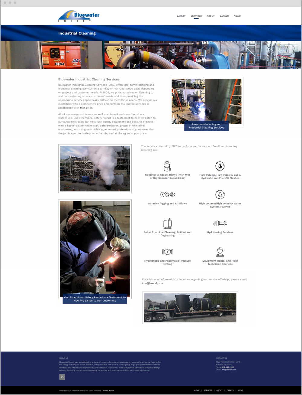
Before 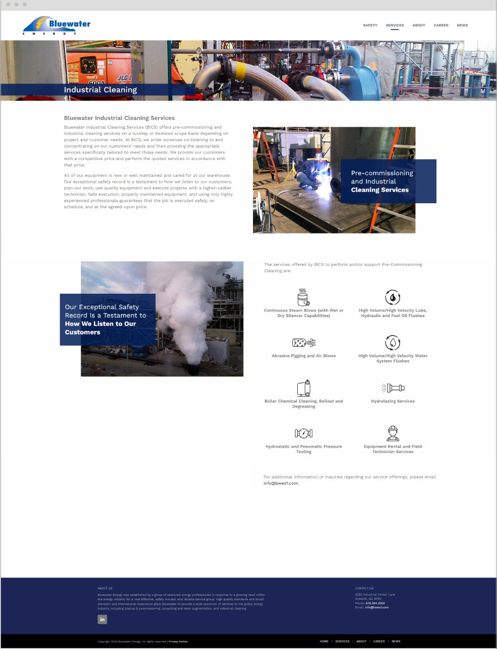
After
The second update we made consisted of redesigning the Services section on Bluewater’s Homepage. It was necessary to add the new fourth services unit to this section, and we also wanted to improve and modernize it. Previously this section included pictures for each of the service offerings with thin grey rectangles and lines existing as design elements. Since the homepage is already so image-heavy with the picture slider above this section and the mission statement picture below it, we felt that this section would be better off without photos, and sought to make it simpler.
We removed the photos and added icons to represent each of the service units instead, and then also added brief text about the services and blue buttons, placing all of these elements inside large squares with light grey outlines. As a whole the Services section is now less busy and more modernized, with the additional white space making the design cleaner and easier on the eyes and the icons adding visual interest, as seen in the Before and After photo below:
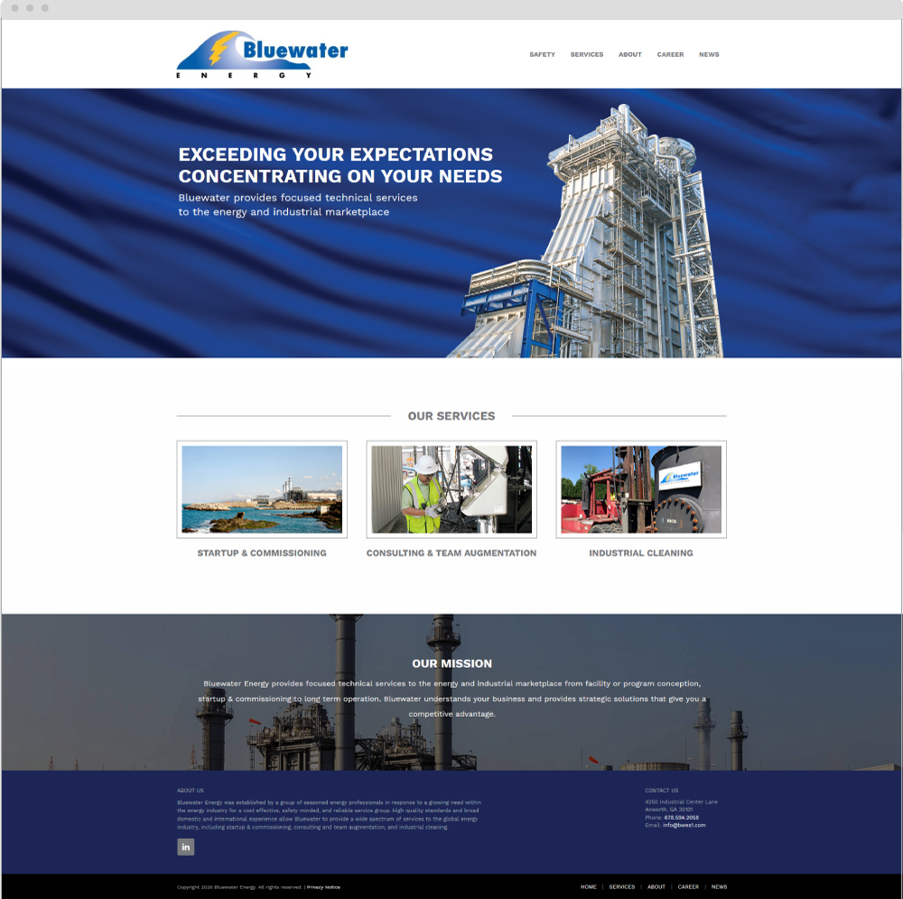
Before 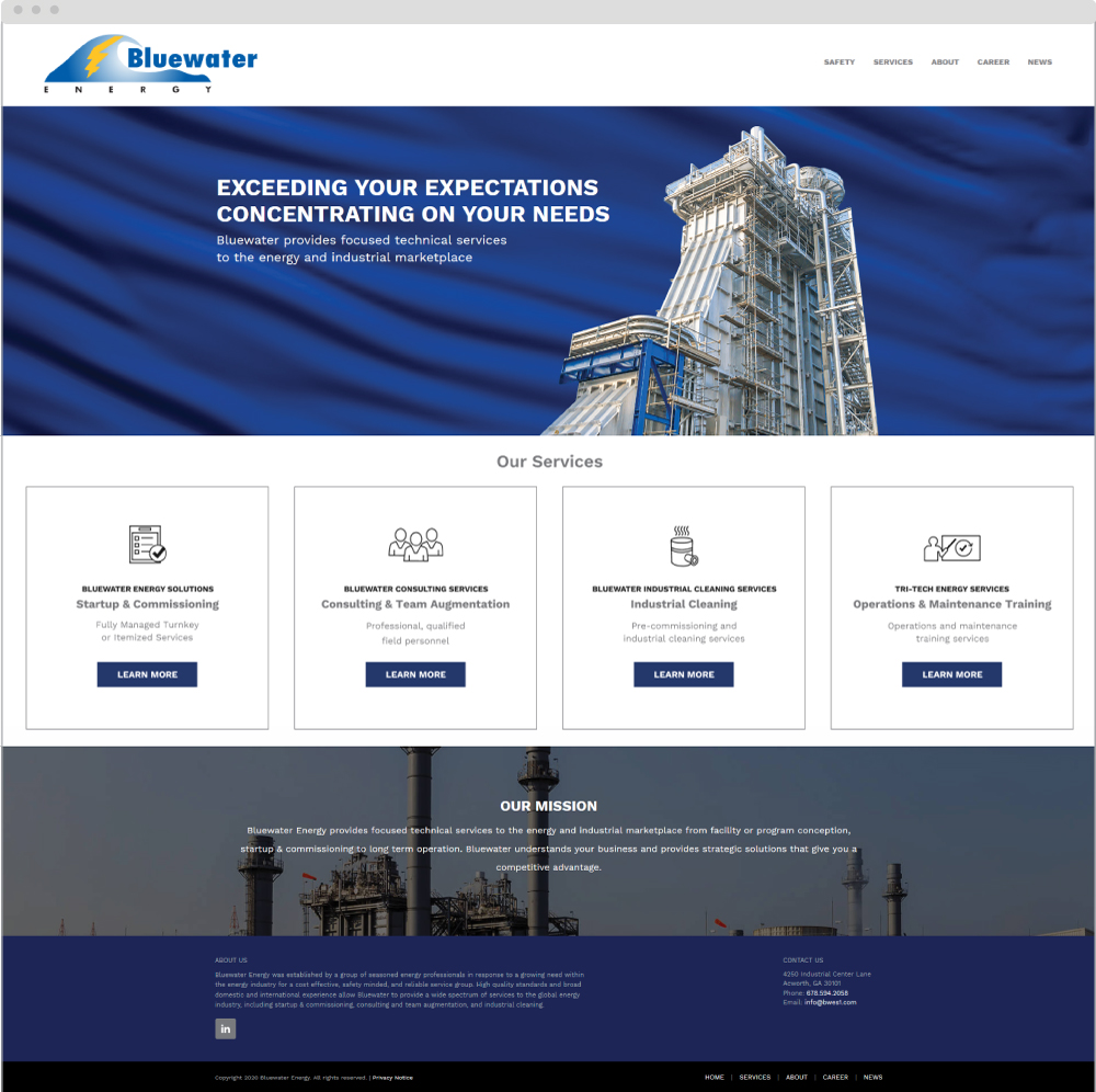
After
Additional updates that we made to the Bluewater website included updating the verbiage on the site in various places where information about the new services unit needed to be mentioned, updating the Services Units Diagram on the About page, and switching out a couple of photos for new and improved ones that better represent the content. Working together, all of these updates and changes serve to refresh the website’s content, making it reflect the new changes in the company and bringing it up to date and modernizing the design. This will ensure that Bluewater’s website continues to be effective and works towards the long-term success of the company.
Hopefully after reading through this example of how website updates are implemented, you are able to see what is involved and the difference that updating can make. Even though we didn’t do a major rehaul of Bluewater’s website, you can see how all of these smaller changes and updates added up and worked together to improve and refine the site as a whole. It is a must to regularly take the time to evaluate your business’s website and update its content. Doing so will pay off in the long run, ensure the success of your content marketing, and keep you from running into problems that could potentially present themselves if your site becomes stale and falls behind the times.
Does your website need updating? Would you like to have a website in place that you can update yourself? Contact us today!
Back to Blog
